
You must log in or register to comment.
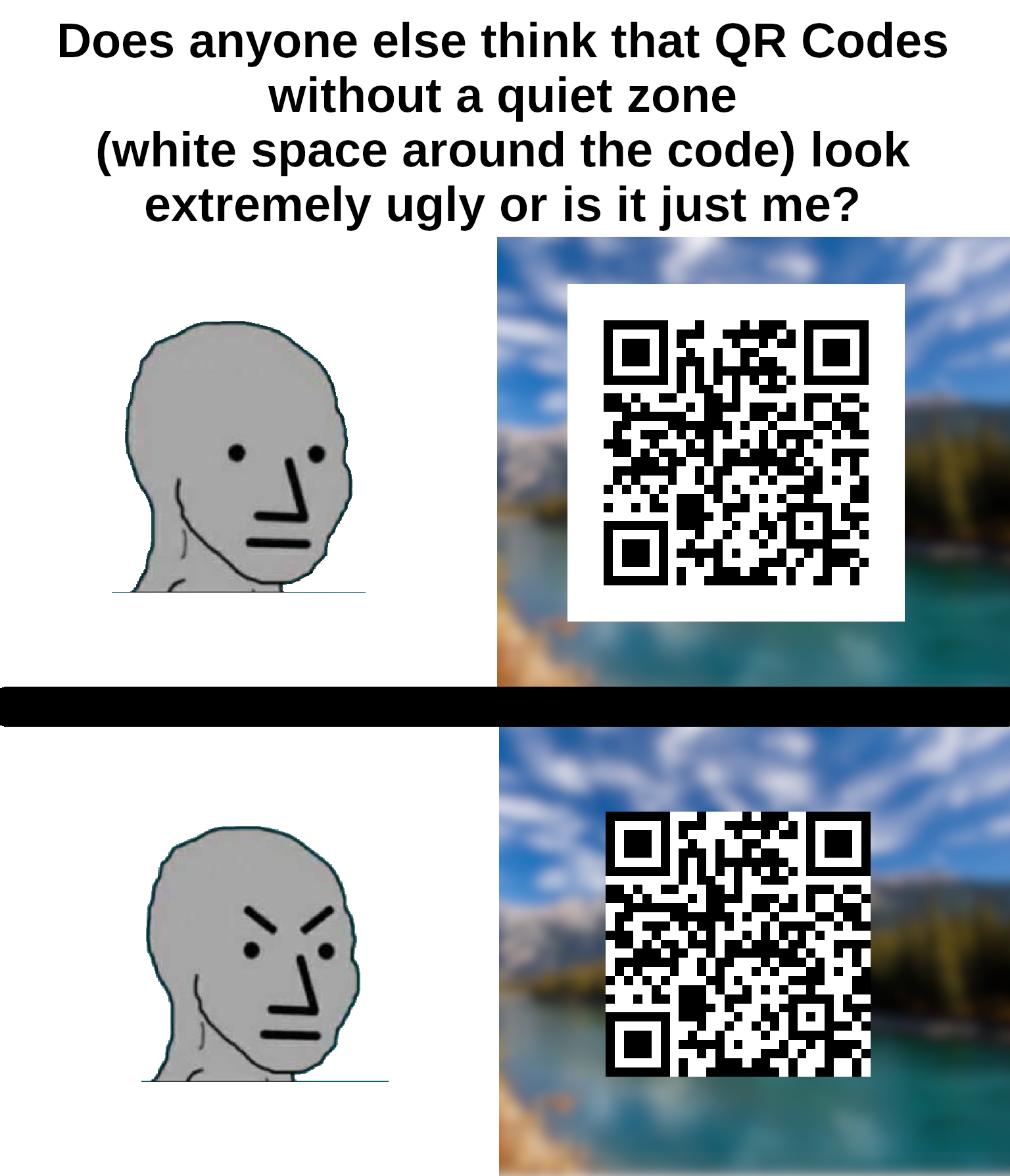
I think that the white space is actually part of the protocol?
It is.
I am watching veritasium last vid on how qr codes work as we speak
Lol this exact video is what prompted me to make the meme
It’s required for contrast detection.
Also, if it was placed on something with a black background, the borders would bleed into the background and be unrecognizable when scanning.
This is why graphic artists don’t get to determine functional standards.
The error correction isn’t enough to overcome a bad background?
My memories of the early days of designing these things for ad clients (we’re talking 2010-11) were that like 20% “damage” was allowed before scanning became difficult. So of course my art director wanted to put cutesy shit all over them to be “unique”.
I just didn’t want the client to ask when it didn’t work because their phones didn’t like them.
People like your art director are the reason people like my product manager want us to write code to verify QR codes, so that our clients can tell their clients that they forgot the quiet zone and their client’s clients may have trouble reading the code.
Damn that’s a lot of levels of clients.
I spent 20 years in graphic design shit and wish I’d thought of something as cool as “quiet zone”.
I’ve seen at least one company press kit in rules on how to display their logo refer to it as “respect distance”.
I’ve usually used “clear space” because that’s common with spaces around logos but i like respect distance. though I don’t know what people in general would think of it after social distancing being associated with a terrible period of our lives.
You can’t circumcise the QR code man!
everything is. whitespace is an important part of graphic design, especially margins. think about text that’s too close to the edge is the page or screen.
especially margins
Since it has the background color of the QR code, it’s probably padding, not margin.
^someone please rescue me from frontend dev^
I can’t imagine giving a fuck…


