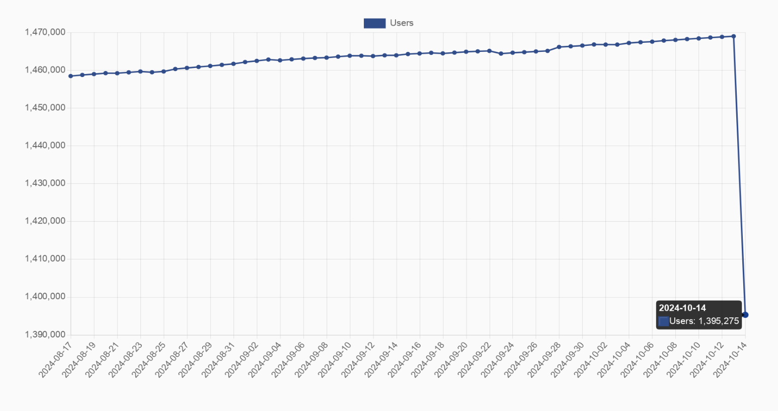
Blaze@feddit.org to Fediverse@lemmy.worldEnglish · edit-21 day agoAlright guys, who shut down their farmbot yesterday? Loss of 70k users (5%), graph might be misleading feddit.orgimagemessage-square48fedilinkarrow-up1263arrow-down112file-text
arrow-up1251arrow-down1imageAlright guys, who shut down their farmbot yesterday? Loss of 70k users (5%), graph might be misleading feddit.orgBlaze@feddit.org to Fediverse@lemmy.worldEnglish · edit-21 day agomessage-square48fedilinkfile-text
minus-squareJumuta@sh.itjust.workslinkfedilinkEnglisharrow-up7arrow-down3·20 hours agono it’s not? you can see the axes and op even mentions that it’s a 5% drop the graph is clearly just fitted to the data
minus-squareThomasLadder_69@lemmy.mllinkfedilinkEnglisharrow-up1·10 minutes ago the graph is clearly just fitted to the data That’s the problem. It’s heavily skewed when compared to the greater overall engagement statistics.
minus-squarelennivelkant@discuss.tchncs.delinkfedilinkEnglisharrow-up5arrow-down1·4 hours agoIn my classes on analytics, we were taught to prefer using normalised axes starting at 0 to more accurately put changes into perspective.
minus-squareBlaze@feddit.orgOPlinkfedilinkEnglisharrow-up10·20 hours agoI edited the title after their comment, it wasn’t that clear at the beginning


no it’s not?
you can see the axes and op even mentions that it’s a 5% drop
the graph is clearly just fitted to the data
That’s the problem. It’s heavily skewed when compared to the greater overall engagement statistics.
In my classes on analytics, we were taught to prefer using normalised axes starting at 0 to more accurately put changes into perspective.
I edited the title after their comment, it wasn’t that clear at the beginning