- cross-posted to:
- fediverse@lemmy.ml

- cross-posted to:
- fediverse@lemmy.ml
We propose the symbol ⁂ to represent the fediverse.
…
⁂ is called an asterism. In astronomy, it refers to groups of stars in the sky, akin to constellations. We suggest that it’s a very fitting symbol for the fediverse, a galaxy of interconnected spaces which is decentralised and has an astronomically-themed name. It represents several stars coming together, connecting but each their own, without a centre.
…
@ is the symbol for e-mail. # is the symbol for hashtags. ☮ is the symbol for peace. ♻ is the symbol for recycling. ⁂ can be the symbol for the fediverse. ⁂ is standardised as Unicode U+2042, making it ready to copy and insert anywhere.
Git Repository: fediverse-symbol/fediverse-symbol
You must log in or register to comment.
a bunch of assholes conected to each other… sounds about right.
I was gonna say snowflakes, but now I can’t unsee the buttholes.
If Greendale Community College was a University.
What I’m hearing here is
Proposal to add current Fediverse symbol to Unicode
closest current one I can find is
⛥
or
⬠
I kind of like the idea of just using pentagram. ⛥
Close enough to the current logo in appearance, scales well, not used by other social media, satanic undertones.
I don’t think the satanic undertones are a good thing 🤣
Booo!!! Satan hater!! Hey everyone, this guy hates Satan!!!
Why wouldn’t I hate Satan? Man’s literally responsible for everything wrong with our society 🤣
…you think Satan is a literal man and “responsible for everything wrong with our society”? 🤯 Allow me to ruin Santa Claus for you next.
I didn’t say he is literally a man 🤣 It’s an expression. He’s an archangel specifically.
I’d rather see the current
 logo added to Unicode than reuse an existing symbol. It’s not impossible, considering that the Bitcoin symbol (₿) ended up making it.
Not that these are the common denominator we should be catering to, but I think a lot of religious folks would get some negative connotations from that symbol, considering how much it looks like a pentagram.
And an emoji for moths too
I’m still fighting for a poutine emoji 💪
I don’t think it works well typographically but I’d like to see a mockup
I think it would work fine as an emoji though.
but that’s a disgusting logo
I think it’s too complex to be a Unicode character
Looking at how current emojis tend to be hard to distinguish without increasing the font size (I see ~13 px on this page), I’d say the fediverse icon fits the criterion well enough.
Also,
 I can see the icon in here well enough
However, its design is a little too complex to be used at small sizes, as you would in text or in a button.
I wonder what the criteria are. Because ⁂ just looks like three blurry dots to me. It’s not making things worse, but I wouldn’t say it’s making them much better either.
Whoever decided that a logo should be standardised as Unicode? That is the worst criterion for picking a symbol that has and will have hundreds of other uses than inline text. If it’s so important — work to have the current, pentacle fediverse symbol included in Unicode.
Registering a domain to introduce your dumb idea with a lot of empty bravado leaves you with … an annual bill and a dumb idea. The pentacle symbol is so much more recognisable.
Testing a little side by side comparison
⁂

And in white, for the dark mode folks:
⁂

But it’s hardly a fair comparison, especially because it seems I cannot upload SVG files to Mbin. I also didn’t make the lines thinner or any other adjustments that might be a good idea at this scale. Still, might be better than noting.
At least on my screen and font size, the three asterisks are way too small to be recognizeable as a logo.
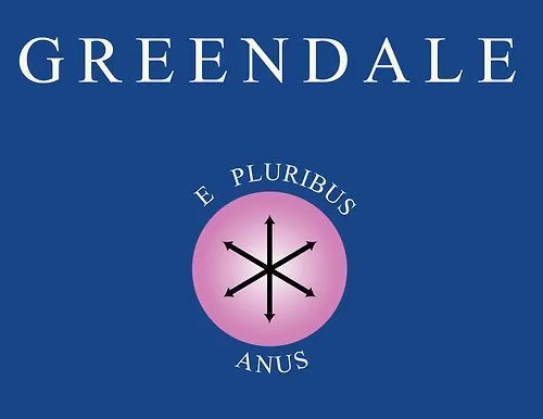
First thought: e pluribus anus

I’m more partial to the pentagram/star ⛤🌟 shape of the current fediverse logo. It would be nice to have a monochrome and emoji form in unicode, just have the pentagram encased in a pentagon.
Its use looks contrived to me on the linked GitHub page. The comparison with @ and # is flawed because those symbols are part of the resource name, whereas here the symbol is superfluous. It’s like adding a 🌐 in front of every web URL.

i like the gay satanism icon
Do we need to address the typographical issues for the existing symbol? I am not using that symbol every time I talk about fedi. Fedi accounts are identified as @username@instance, so there’s no need to use some obscure unicode.
Of note: ActivityPub (the protocol) has its own logo, seen in https://activitypub.rocks/ and other places. The protocol and the community are absolutely separate things, so this is really good.
I’ve never really linked the rainbow star icon, just because I don’t really like rainbows (IMO the ace flag is the prettiest but I might be biased). I’m also still not convinced that Meta’s icon is even supposed to represent the fediverse, as opposed to just a Threads feature that lets it connect to the fediverse. So overall I’m a fan of this proposal, although it does bug me that it uses 6-pointed stars in the font on the webpage and 5-pointed stars in most other typefaces. The 5-pointed stars create some nice negative space.
Stealing an icon already designated for something else? As is tradition
Having a unicode icon that can be copy pasted anywhere is nifty, but yeah I’m really not a fan of choosing this one.